 Ranvier.Terminal
Component gallery
Framebuffer previews of the native indicators, meters, tables and popup widgets in the Showcase.
These previews come from the terminal renderer. Run the Showcase, then open Components to operate the controls with the keyboard or mouse.
Task indicators
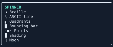
Use TaskStatus.create when one control follows a task through queued, running, and finished states. For a standalone animation, the optional Ranvier.Terminal.Components library provides Spinner.create and Pulse.create. Pass a tick accessor so animations share the application's clock.
Meters
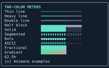
Use the same fraction to compare presentations. Thin, heavy, and double lines distinguish the filled portion by color. Dotted and segmented meters also distinguish it by shape. Fractional blocks resolve changes smaller than one cell.
open Ranvier.Terminal
open Ranvier.Terminal.Components

let level = Meter.create Meter.ThinLine [] 24 (Rgb 0x65E0C8) (Rgb 0x556270) progress
Here progress is a unit -> float accessor returning a value between zero and one.
Tables
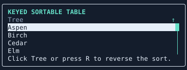
Bind a table's selected key when users need to keep their place through a refresh or reorder. In the Showcase, click the sortable header or focus the table and press R to reverse its order. Drag the scrollbar thumb to move through rows. Selection and navigation
Popups
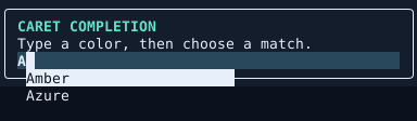
Tooltips attach to a control. Completion lists attach to the editor caret and keep keyboard focus in the editor. Mount their floating surfaces in a Popup.host so they can appear over adjacent content.